Tropes Exemplified in Works of Art 2: Metonymy
by Mark Staff Brandl
This week, I am continuing my short series of fine artworks exemplifying major tropes. This is the second entry.
The list of major tropes I am referring to I published on this website a while ago, “A List of the Most Important Tropes and Their Definitions”; here is the link: http://www.metaphorandart.com/articles/trope_list.html
As I said in part 1, over the next several weeks, I will take each trope from the list and link it to a major work of art. This will include artworks from a large variety of time periods and in many different media, if I am successful. Generally, I will be looking for artworks that embody the trope under consideration within their formal elements, clearly showing a trope in visual use. Last time I discussed metaphor. This week, Number 2:
Metonymy
What is the definition of metonymy?: A trope in which one word or phrase is substituted for another with which it is closely associated; describing something indirectly by referring to things around it or from the context. “The White House spoke of 77 injured soldiers.”
To call this forth as a simple illustration in language, this mechanism could entail the replacement of “publishing” for “writing” or “filming” for “directing.”
My choice for an artwork displaying sophisticated use of metonymy is actually several works by Marcel Broodthaers.
The idea of process can be construed in many ways, even that of history itself as artist Marcel Broodthaers has often done. While metonymy can clearly be seen in all of Broodthaers’s best works, one of the purist instances is his imitation of flowery, old-fashioned calligraphy in most of his pieces containing language. Lampe bleue et chaise from 1969, a simple assisted-readymade arrangement of folding chair and spotlight, is an example of this (Link). On the inside surface of the lamp’s reflector Broodthaers scattered lowercase alphabet letters in beautifully painted flowing blue script and installed a blue light bulb.
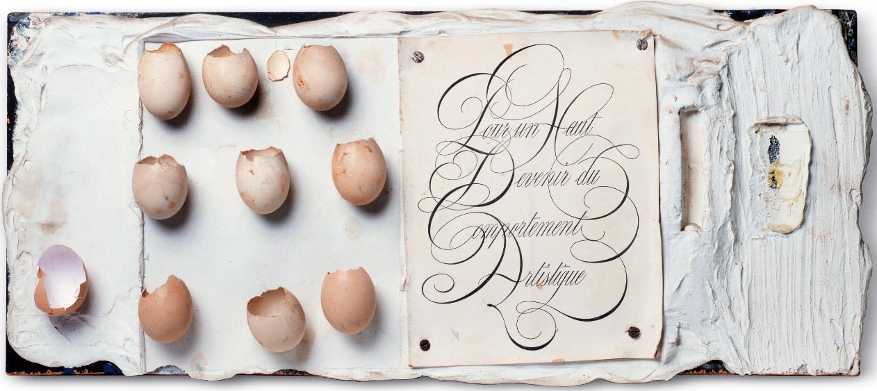
Likewise, each crystal-clear bottle of the 1974 multiple Le manuscript dans une bouteille has elegant, curvilinear, etched font stating solely The Manuscript 1833 (Link). But perhaps most extravagant is the artist’s Pour un haut devenir du comportement artistique. This plaster, eggshell, paper and wood relief of 1964 features two centered book-page-like paper rectangles. The eggshells on the sheet to the left mimic the fragility of the lettering on the one to right. The words are those of the title, so unbelievably over-flourished in an intertwining, ornamented penmanship that they are neigh-impossible to read, cloyingly antiquarian on purpose.

Radical experimenting with type led through Dada and the Bauhaus to modern design. The drastic asymmetry and frenzied admixture of type faces and even languages which occurred in the pages of the Dada publication 291 or Francis Picabia’s own 391 are the consummate examples, and forefathers, of these new forms. This development for Broodthaers is significant and consequential. Fortunately history in Broodthaers’s view is neither opaque as in modernism nor a shopping mall of ideas to appropriate as in post-modernism. Rather, Broodthaers perceives it as a temporal path of relationships, from which he ingeniously chooses a form contiguous with yet opposite to experimental type. He thereby reinforces the originality of the experimenters, while framing their achievement in time. Metonymy.
Next time: Simile.
